Overview
Visualizing a brand in 3OO dpi.
Challenge
The previous logo did not have proper font licenses, leading to potential legal issues and inconsistencies in branding. The logo assets were not in the correct format, resulting in pixelation and unreadability, especially when scaled. The new business lacked a proper inbox setup, which affected its professional identity.
Solution
First we ensured all fonts used in the new logo were properly licensed to avoid legal complications and maintain brand consistency. Designing the logo with the correct assets and file formats (such as vector files) allows for clarity and quality at any size for all use cases. additionally, we established their domain, hooking up theirs teams e-mail to enter that level of professionalism.
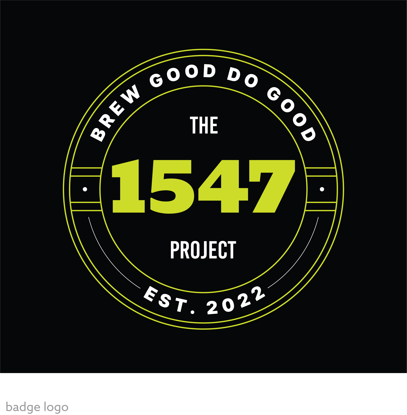
Logo
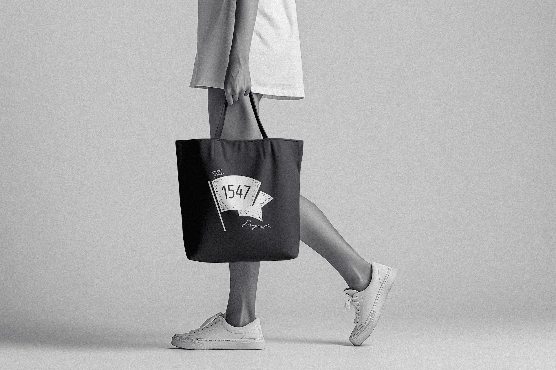
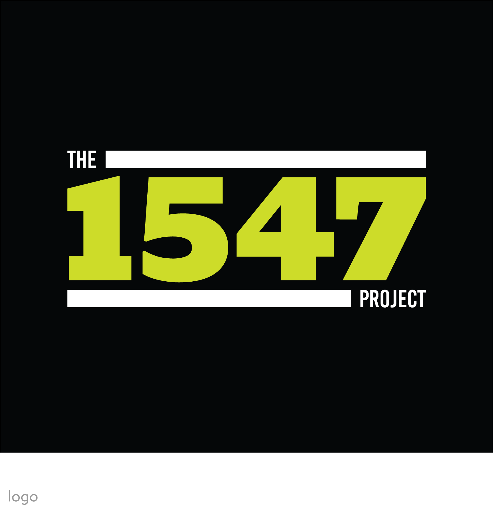
The new logos for The 1547 Project were designed to be bold and easily recognizable. The use of vibrant green against a black background creates a striking contrast that draws attention. The typography is clean and modern, ensuring readability and a professional appearance. Each version of the logo maintains the core elements while offering slight variations to suit different branding needs. The tagline "Brew Good Do Good" encapsulates the project's mission, while the establishment year and location provide context and authenticity.
Color & Type
The refreshed logo features bold, modern typography in a vibrant green against a sleek black background. The choice of green symbolizes freshness, growth, and the craft nature of their brewing process, while the black background provides a striking contrast that enhances readability and visual appeal. This color palette and design were carefully selected to reflect the innovative and high-quality ethos of the brewery.